- 十二、颜色和填充
十二、颜色和填充
在本教程中,我们将介绍一些更多的自定义,比如颜色和线条填充。
我们要做的第一个改动是将plt.title更改为stock变量。
plt.title(stock)
现在,让我们来介绍一下如何更改标签颜色。 我们可以通过修改我们的轴对象来实现:
ax1.xaxis.label.set_color('c')ax1.yaxis.label.set_color('r')
如果我们运行它,我们会看到标签改变了颜色,就像在单词中那样。
接下来,我们可以为要显示的轴指定具体数字,而不是像这样的自动选择:
ax1.set_yticks([0,25,50,75])
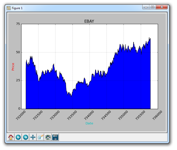
接下来,我想介绍填充。 填充所做的事情,是在变量和你选择的一个数值之间填充颜色。 例如,我们可以这样:
ax1.fill_between(date, 0, closep)
所以到这里,我们的代码为:
import matplotlib.pyplot as pltimport numpy as npimport urllibimport datetime as dtimport matplotlib.dates as mdatesdef bytespdate2num(fmt, encoding='utf-8'):strconverter = mdates.strpdate2num(fmt)def bytesconverter(b):s = b.decode(encoding)return strconverter(s)return bytesconverterdef graph_data(stock):fig = plt.figure()ax1 = plt.subplot2grid((1,1), (0,0))stock_price_url = 'http://chartapi.finance.yahoo.com/instrument/1.0/'+stock+'/chartdata;type=quote;range=10y/csv'source_code = urllib.request.urlopen(stock_price_url).read().decode()stock_data = []split_source = source_code.split('\n')for line in split_source:split_line = line.split(',')if len(split_line) == 6:if 'values' not in line and 'labels' not in line:stock_data.append(line)date, closep, highp, lowp, openp, volume = np.loadtxt(stock_data,delimiter=',',unpack=True,converters={0: bytespdate2num('%Y%m%d')})ax1.fill_between(date, 0, closep)for label in ax1.xaxis.get_ticklabels():label.set_rotation(45)ax1.grid(True)#, color='g', linestyle='-', linewidth=5)ax1.xaxis.label.set_color('c')ax1.yaxis.label.set_color('r')ax1.set_yticks([0,25,50,75])plt.xlabel('Date')plt.ylabel('Price')plt.title(stock)plt.legend()plt.subplots_adjust(left=0.09, bottom=0.20, right=0.94, top=0.90, wspace=0.2, hspace=0)plt.show()graph_data('EBAY')
结果为:
填充的一个问题是,我们可能最后会把东西都覆盖起来。 我们可以用透明度来解决它:
ax1.fill_between(date, 0, closep)
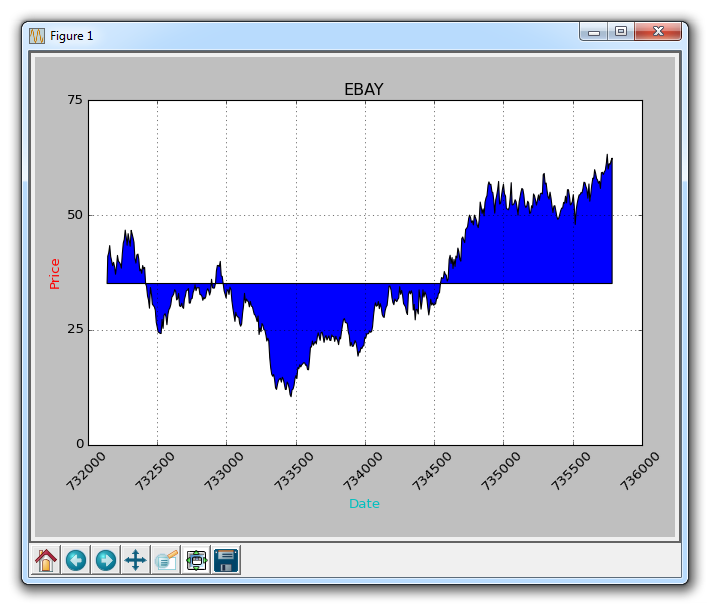
现在,让我们介绍条件填充。 让我们假设图表的起始位置是我们开始买入 eBay 的地方。 这里,如果价格低于这个价格,我们可以向上填充到原来的价格,然后如果它超过了原始价格,我们可以向下填充。 我们可以这样做:
ax1.fill_between(date, closep[0], closep)
会生成:
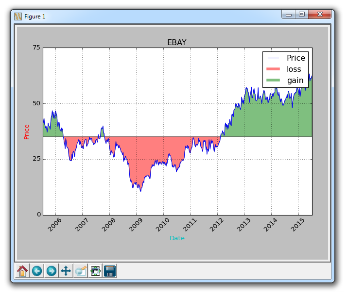
如果我们想用红色和绿色填充来展示收益/损失,那么与原始价格相比,绿色填充用于上升(注:国外股市的颜色和国内相反),红色填充用于下跌? 没问题! 我们可以添加一个where参数,如下所示:
ax1.fill_between(date, closep, closep[0],where=(closep > closep[0]), facecolor='g', alpha=0.5)
这里,我们填充当前价格和原始价格之间的区域,其中当前价格高于原始价格。 我们给予它绿色的前景色,因为这是一个上升,而且我们使用微小的透明度。
我们仍然不能对多边形数据(如填充)应用标签,但我们可以像以前一样实现空线条,因此我们可以:
ax1.plot([],[],linewidth=5, label='loss', color='r',alpha=0.5)ax1.plot([],[],linewidth=5, label='gain', color='g',alpha=0.5)ax1.fill_between(date, closep, closep[0],where=(closep > closep[0]), facecolor='g', alpha=0.5)ax1.fill_between(date, closep, closep[0],where=(closep < closep[0]), facecolor='r', alpha=0.5)
这向我们提供了一些填充,以及用于处理标签的空线条,我们打算将其显示在图例中。这里完整的代码是:
import matplotlib.pyplot as pltimport numpy as npimport urllibimport datetime as dtimport matplotlib.dates as mdatesdef bytespdate2num(fmt, encoding='utf-8'):strconverter = mdates.strpdate2num(fmt)def bytesconverter(b):s = b.decode(encoding)return strconverter(s)return bytesconverterdef graph_data(stock):fig = plt.figure()ax1 = plt.subplot2grid((1,1), (0,0))stock_price_url = 'http://chartapi.finance.yahoo.com/instrument/1.0/'+stock+'/chartdata;type=quote;range=10y/csv'source_code = urllib.request.urlopen(stock_price_url).read().decode()stock_data = []split_source = source_code.split('\n')for line in split_source:split_line = line.split(',')if len(split_line) == 6:if 'values' not in line and 'labels' not in line:stock_data.append(line)date, closep, highp, lowp, openp, volume = np.loadtxt(stock_data,delimiter=',',unpack=True,converters={0: bytespdate2num('%Y%m%d')})ax1.plot_date(date, closep,'-', label='Price')ax1.plot([],[],linewidth=5, label='loss', color='r',alpha=0.5)ax1.plot([],[],linewidth=5, label='gain', color='g',alpha=0.5)ax1.fill_between(date, closep, closep[0],where=(closep > closep[0]), facecolor='g', alpha=0.5)ax1.fill_between(date, closep, closep[0],where=(closep < closep[0]), facecolor='r', alpha=0.5)for label in ax1.xaxis.get_ticklabels():label.set_rotation(45)ax1.grid(True)#, color='g', linestyle='-', linewidth=5)ax1.xaxis.label.set_color('c')ax1.yaxis.label.set_color('r')ax1.set_yticks([0,25,50,75])plt.xlabel('Date')plt.ylabel('Price')plt.title(stock)plt.legend()plt.subplots_adjust(left=0.09, bottom=0.20, right=0.94, top=0.90, wspace=0.2, hspace=0)plt.show()graph_data('EBAY')
现在我们的结果是: