 我的书签
我的书签
 添加书签
添加书签 移除书签
移除书签- Popover 弹出框
- 基础用法
- 嵌套信息
- 嵌套操作
- Attributes
Popover 弹出框
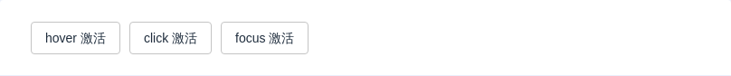
基础用法
Popover 的属性与 Tooltip 很类似,它们都是基于Popper.js开发的,因此对于重复属性,请参考 Tooltip 的文档,在此文档中不做详尽解释。
嵌套信息
可以在 Popover 中嵌套多种类型信息,以下为嵌套表格的例子。
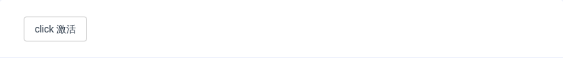
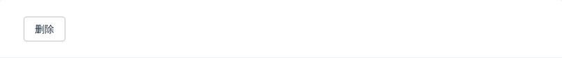
嵌套操作
当然,你还可以嵌套操作,这相比 Dialog 更为轻量:
Attributes
| 参数 | 说明 | 类型 | 可选值 | 默认值 |
|---|---|---|---|---|
| trigger | 触发方式 | String | click/focus/hover | click |
| title | 标题 | String | — | — |
| content | 显示的内容,也可以通过 slot 传入 DOM | String | — | — |
| width | 宽度 | String, Number | — | 最小宽度 150px |
| placement | 出现位置 | String | top/top-start/top-end/bottom/bottom-start/bottom-end/left/left-start/left-end/right/right-start/right-end | bottom |
| visible | 状态是否可见 | Boolean | — | false |
| transition | 定义渐变动画 | String | — | fade-in-linear |
| visibleArrow | 是否显示 Tooltip 箭头 | Boolean | — | true |
| popperClass | 为 popper 添加类名 | String | - | - |
